Photo Textures: Film Grain, Paper, Linen & More Explained
Photo textures give images a tactile, print-like feel. Learn what procedural textures are, how film grain, paper, linen, dots, and grid textures work, and how to apply them to a batch.
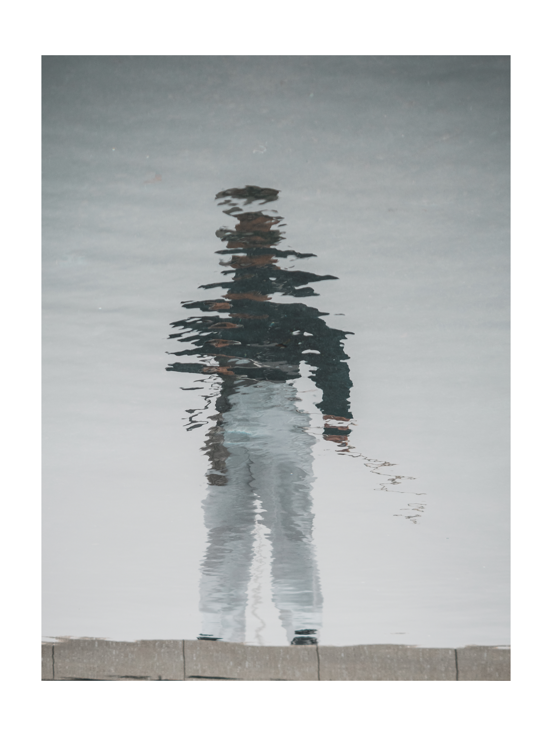
If a photo looks too digital, the fix usually isn’t an effect. It’s a texture.
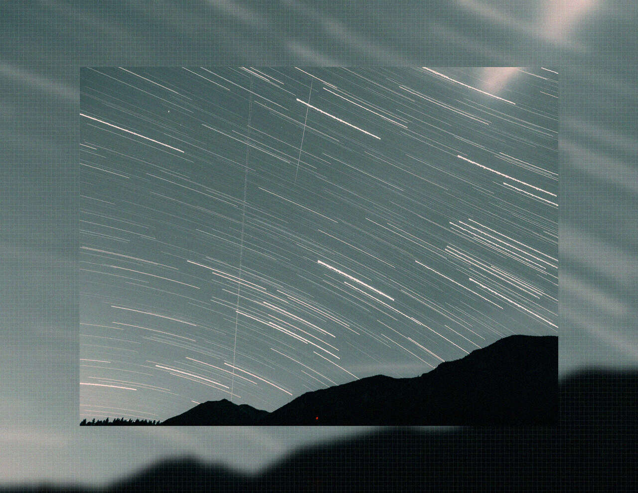
Textures are the layer between your photo and reality — the grain of film, the tooth of paper, the weave of linen, the flatness of a printed grid. They’re what makes an image feel like something you could touch, and they’re the fastest way to make a batch of photos look like a deliberate body of work.
What is a procedural texture?
A procedural texture is a pattern generated by code instead of photographed or scanned. That matters for two reasons:
- It’s unlimited. No stock texture to run out of, no seams to crop around.
- It’s consistent. Every photo in a batch gets the exact same pattern at the exact same scale — which is precisely what hand-placed textures can’t promise.
In DelightfulBorders, textures are tiled patterns that sit on top of your background. You control two things: scale (how large or fine the pattern is) and thickness (how strongly it reads).
The textures that matter
Film grain / noise
Randomly distributed luminance variation. This is the closest thing to a universal texture — it lives at any size and looks natural on almost anything. Heavy or fine, warm or neutral, grain is the default first texture for a reason.
Paper
A fine, organic speckle — like the tooth of cold-press watercolor paper. Put it under a portrait and the image reads as printed. It’s one of the most requested textures for wedding and lifestyle photography because it softens the clinical digital edge.
Linen
A woven fabric weave. Best at larger scale where the weave is visible. Great for warm, tactile feels — think cards, invitations, and cozy brand photos.
Grid
A clean ruled grid — like a notebook or architectural drafting paper. At low opacity it adds structure; at higher opacity it becomes a design element. Designers reach for this one constantly.
Dots
A halftone-style dot field. At fine scale it’s subtle texture; at coarse scale it’s comic-print boldness. It sits somewhere between a texture and a graphic effect.
Diagonal
Angled hatching lines. Directional and energetic — it adds motion that a static texture can’t. Great for a modern, editorial slant.
Scale and thickness: the two dials
The same texture can look completely different based on two settings:
- Scale — how big each pattern cell is. Fine scale = subtle, paper-like. Coarse scale = bold, graphic, print-like.
- Thickness — how opaque/prominent the pattern is. Low = whisper. High = the texture becomes the image.
Here’s the mental model: scale controls the size of the pattern, thickness controls its presence. For a professional look, lean toward fine scale and low thickness. For art direction, push both.
Choosing a texture for your photo
| Texture | Feel | Best subjects |
|---|---|---|
| Film grain | Cinematic | Everything, especially dark/moody shots |
| Paper | Printed, tactile | Portraits, weddings, lifestyle |
| Linen | Warm, woven | Cards, brands, cozy content |
| Grid | Structured | Architecture, design work, tech |
| Dots | Graphic, halftone | Editorial, posters, bold content |
| Diagonal | Energetic | Movement, fashion, abstract |
Textures work best in a batch
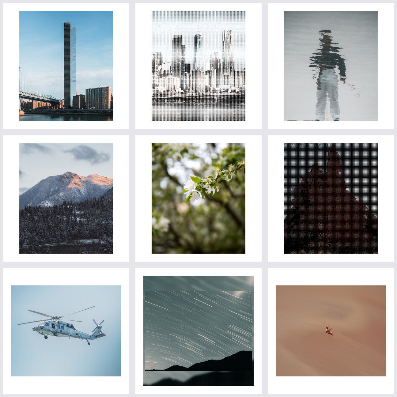
A texture is a system effect — it pulls a set of photos together. A grid of 12 photos, each with the same fine paper texture, looks like a printed series. Twelve photos each with a different texture looks like a random collection.
That’s why texture is a batch setting, not a per-photo one. Apply it once, and every photo in the set inherits the same paper (or linen, or grain) at the same scale and thickness.
Textures vs. effects
Quick distinction, since the two get confused:
- Textures are patterns behind or around the photo (paper, grid, linen) — they change the surface the image sits on.
- Effects are treatments on the photo itself (grain, glitch, halftone) — they change the image’s pixels.
You can absolutely combine them: a paper texture on the border with a subtle grain effect on the photo is the full “printed film still” look. See the photo effects guide for the pixel-level treatments.
Putting it together
The fastest way to a cohesive, tactile set:
- Pick one texture that fits the mood of the shoot.
- Set scale and thickness once.
- Apply it to the whole batch.
- Save the look as a profile so next month’s shoot matches.
Keep reading
- Photo effects explained: grain, glitch, halftone & more
- Apply film grain to 40 photos at once
- All texture guides
DelightfulBorders is a one-time purchase on the App Store — everything runs on-device, no subscription.
Try it with your next batch
DelightfulBorders adds borders, textures, and effects to dozens of photos at once. One-time purchase, no subscription, and everything stays on your device.